Worst ads
These real video ads from the Meta Ad Library scored lowest on the Wall. Each roast names what went wrong, so each one is a lesson in what to cut from your own ad.
The 12 lowest scores among 311 live Wall ads, one ad per advertiser. Scores are the latest AI roast on AdMaxxing, out of 100. The score is an AI critique of what a viewer sees in the ad. It does not measure how the ad performed.
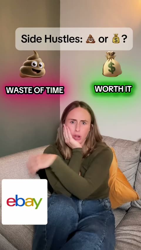
Everygen
15/ 100
Side hustle bait that finally shows the product at 23 seconds. Cute baby, late rescue.
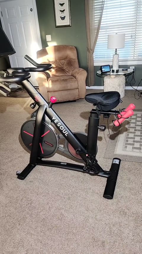
Yesoul
21/ 100
A living room walkaround that completely forgets to sell the bike.
Clarity 5/10: You see a stationary bike, but learn nothing about what makes it unique.
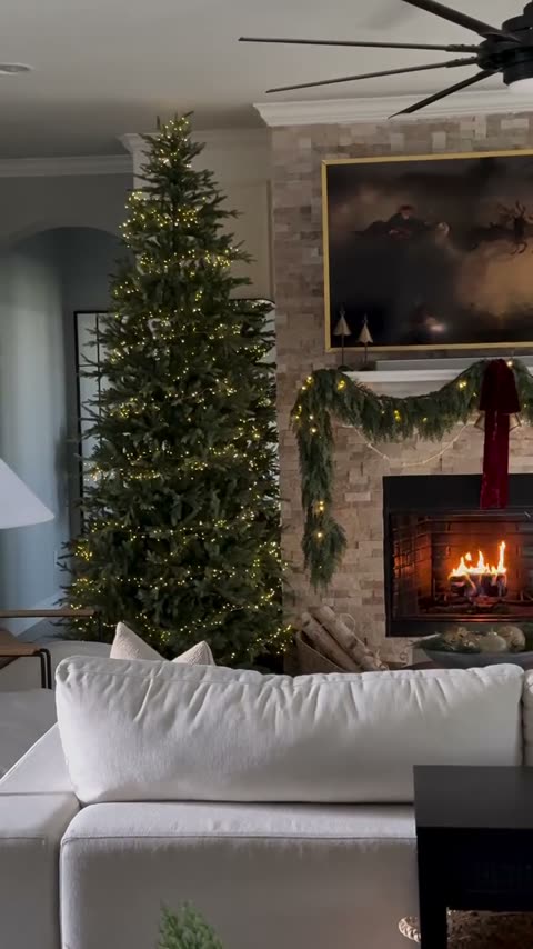
Simply Designed Interiors
22/ 100
Vibe maxxing so hard you forgot to tell anyone what you sell.
Clarity 1/10: Without reading the caption, viewers cannot tell if the tree or couch is for sale.
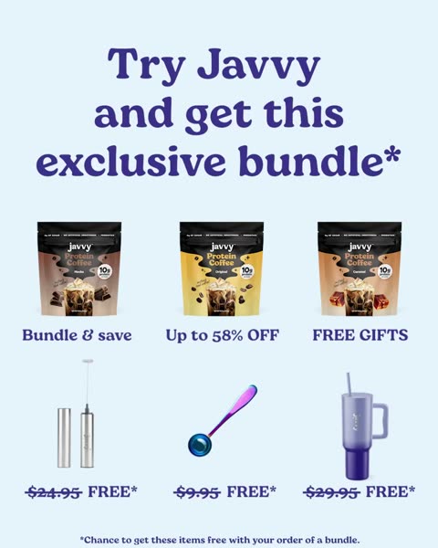
Black Friday Coffee Deals
24/ 100
Exporting a static flyer as an MP4 is negative aura behavior.
Clarity 5/10: Clear product bags, but the fine print confuses the deal.

Swagga.ai
27/ 100
A 54-second car confessional that tells you to make characters, then shows you a dropdown.
Clarity 4/10: AI video and chat tool, but who it is for stays fuzzy.
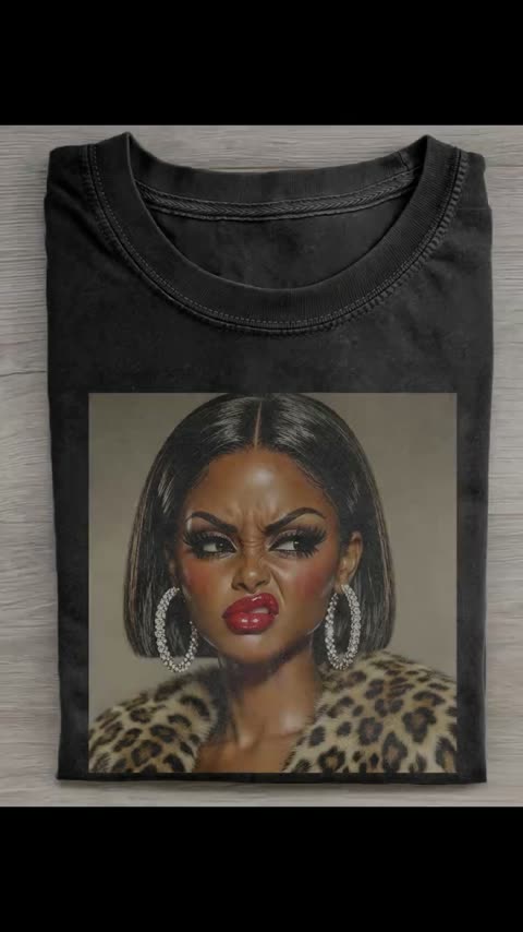
Iuniquetop store
27/ 100
A slideshow mockup with negative aura and zero call to action.
Clarity 6/10: It is clearly selling graphic tees, even if only via flat digital mockups.
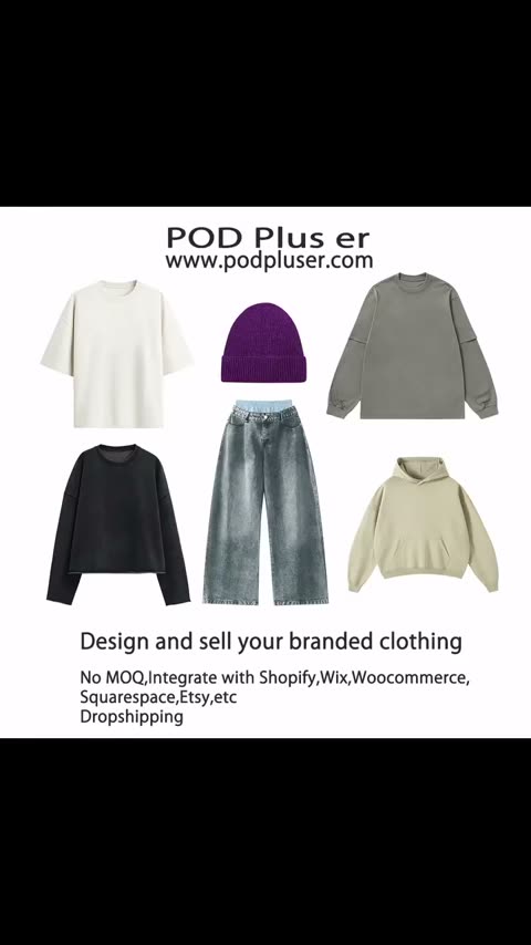
PODpluser
27/ 100
A PowerPoint slide followed by stock photos hoping to start a streetwear empire.
Clarity 5/10: Understands it is print on demand apparel, but looks like a generic catalog.

Shoptemu
29/ 100
Five tops, zero prices, and a title card that burns the first 5 seconds
Clarity 5/10: It's clearly tops, but who they're for and from where is vague.
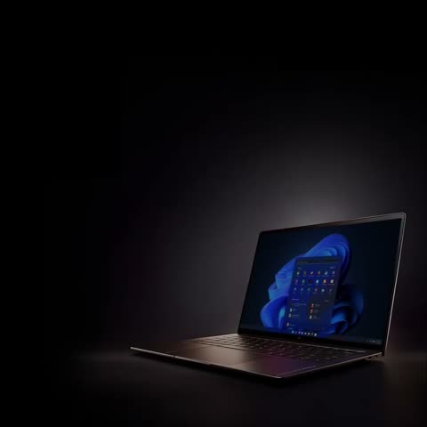
HP
29/ 100
A 16-second powerpoint slide masquerading as a holiday video ad.
Clarity 6/10: Clear that HP has a Black Friday sale on laptops.

Jewel of the orient SPA
30/ 100
A dark candle video that completely forgot to show the actual spa service.
Clarity 5/10: Text mentions scalp treatment, but the visual barely shows the service.
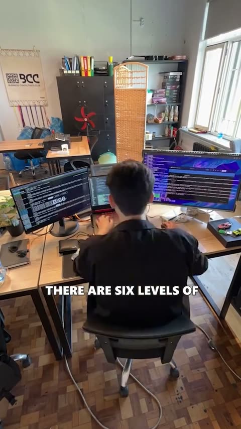
Kodree
31/ 100
A 74-second Claude tutorial wearing a Kodree hat, and the brand never shows up
Clarity 4/10: The level list helps, but the brand and who it's for stay unclear.
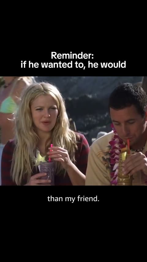
Prime Video
31/ 100
Prime Video posted a twenty year old movie clip with zero branding and clocked out early.
Clarity 3/10: It looks like a random meme page post with no platform context.
How a bad ad loses its points
A low score almost never comes from one mistake. The ads above tend to fail the same way: the first two seconds show a title card, a logo or nothing at all, the product appears late or never, and the ad ends without a price or a next step. The lowest score right now is Everygen at 15/100.
Averaged across this page, the weakest touch points are proof (1.5/10), offer (1.7/10) and call to action (1.8/10). Offer means a concrete reason to act now. Proof means believable evidence on screen. When both are missing, a viewer has no reason to buy and no reason to believe.
Clarity is the note shown under each ad, because it is the test most of these fail first: after one watch, can a stranger say what is sold and to whom? If the answer is no, nothing else in the ad can save it.
Fake buttons, fake timers
Some ads add pressure that is not real: a button drawn into the video that cannot be tapped, a countdown with no deadline behind it, carousel dots on a video that does not swipe. The scorer marks these down: a button that does nothing is a broken next step, and a timer with no deadline is pressure without an offer behind it.
These are the Wall ads whose roast notes call something on screen fake, with the note that says so:
Shoptemu
29/ 100
Five tops, zero prices, and a title card that burns the first 5 seconds
Craft 3/10: Slow 1.8s pacing, fake carousel dots, mixed sources, 5 seconds wasted at the start.
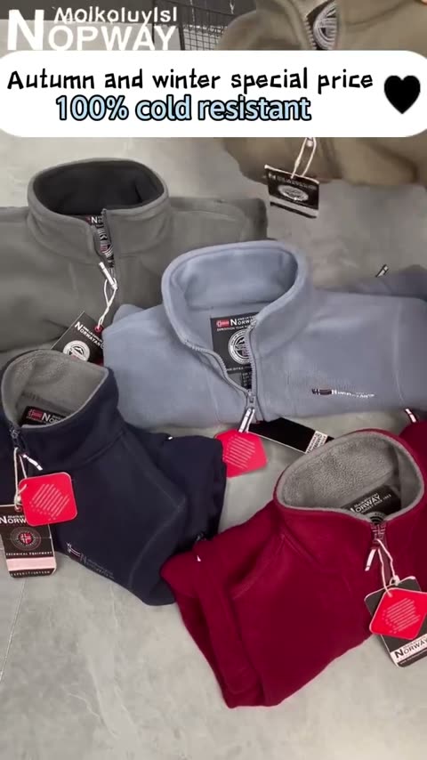
Kyayu shop
35/ 100
Dropship fleece claiming arctic survival with zero aura and fake timer urgency.
Offer 4/10: Mentions half price but uses obvious fake countdown pressure.

DTC Newsletter
41/ 100
A paragraph with a skyline behind it. Reads like a terms page, scrolls like one.
Call to action 6/10: Subscribe for free is plain and easy, though a fake button inside the video adds nothing.

AI Cartoon - Toon Me
49/ 100
A ten second hug that forgot to show the actual app doing anything
Call to action 3/10: Fake button box is not tappable and no install prompt appears in the video.
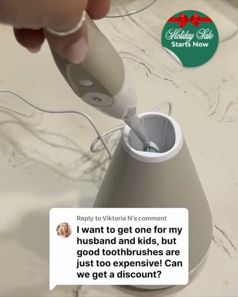
TAO Clean
59/ 100
Seventy seconds of comment reply acting to sell a spaceship dock for teeth.
Hook 4/10: Fake comment reply setup feels tired and scripted.
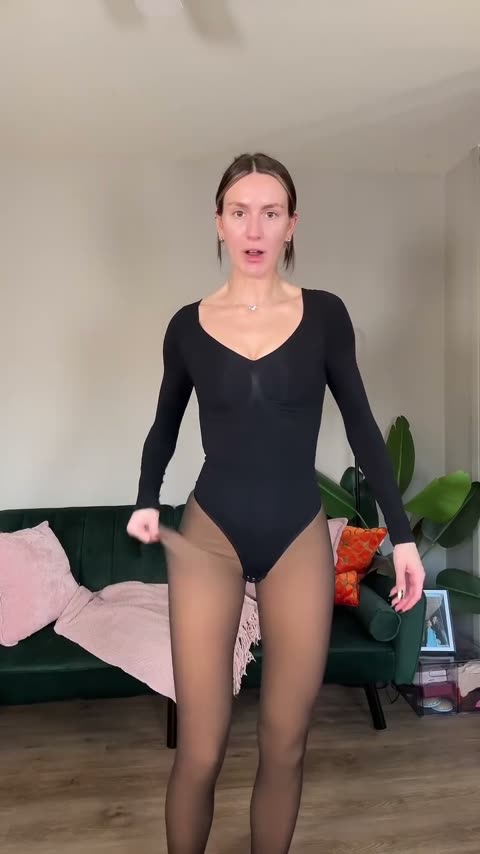
Irazia
59/ 100
A solid product comparison trapped inside fifty four seconds of unbroken yapping.
Clarity 8/10: Crystal clear explanation of how fake sheer fleece tights work without weird seams.
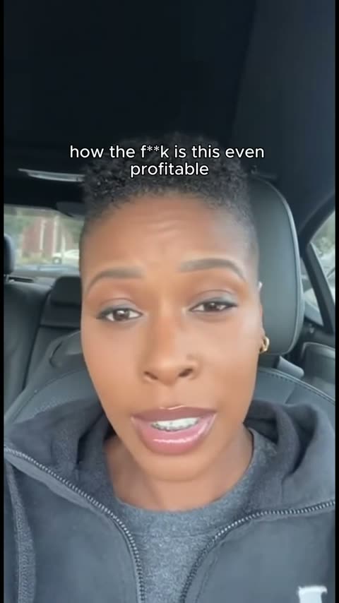
Montier
63/ 100
Car selfie TikTok hook maxxing straight into dropshipped mouth jewelry.
Hook 6/10: Standard fake disbelief car hook stops scrollers but feels dated.
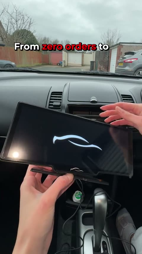
CarTablet
72/ 100
A classic dropship dashboard upgrade running on AI voice and pure discount cope.
Offer 7/10: Eighty percent off feels fake but creates strong direct response urgency.
Fixing an ad like these
Start with the first two seconds: put the product, or the problem it solves, on screen before any logo. Say the price or the deal out loud and in text. End with one action, said once. Those three edits target hook, offer and call to action, which together make up 55 percent of the score.
Roast your own ad free
Upload a video ad and get the same score out of 100 on hook, clarity, offer, proof, call to action and craft, with the notes that explain each one.
Maxx my ad